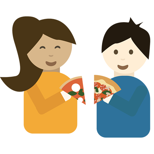
"Food Stats" is an infographics project that explores fun statistics of a variety of foods. The very first episode will only focus on pizza statistics. Users can view and interact with the infographics and add their own data to the website by participating in the survey. It is for people who enjoy pizza and enjoy seeing fun food statistics.
UX/UI Designer
Fall 2020
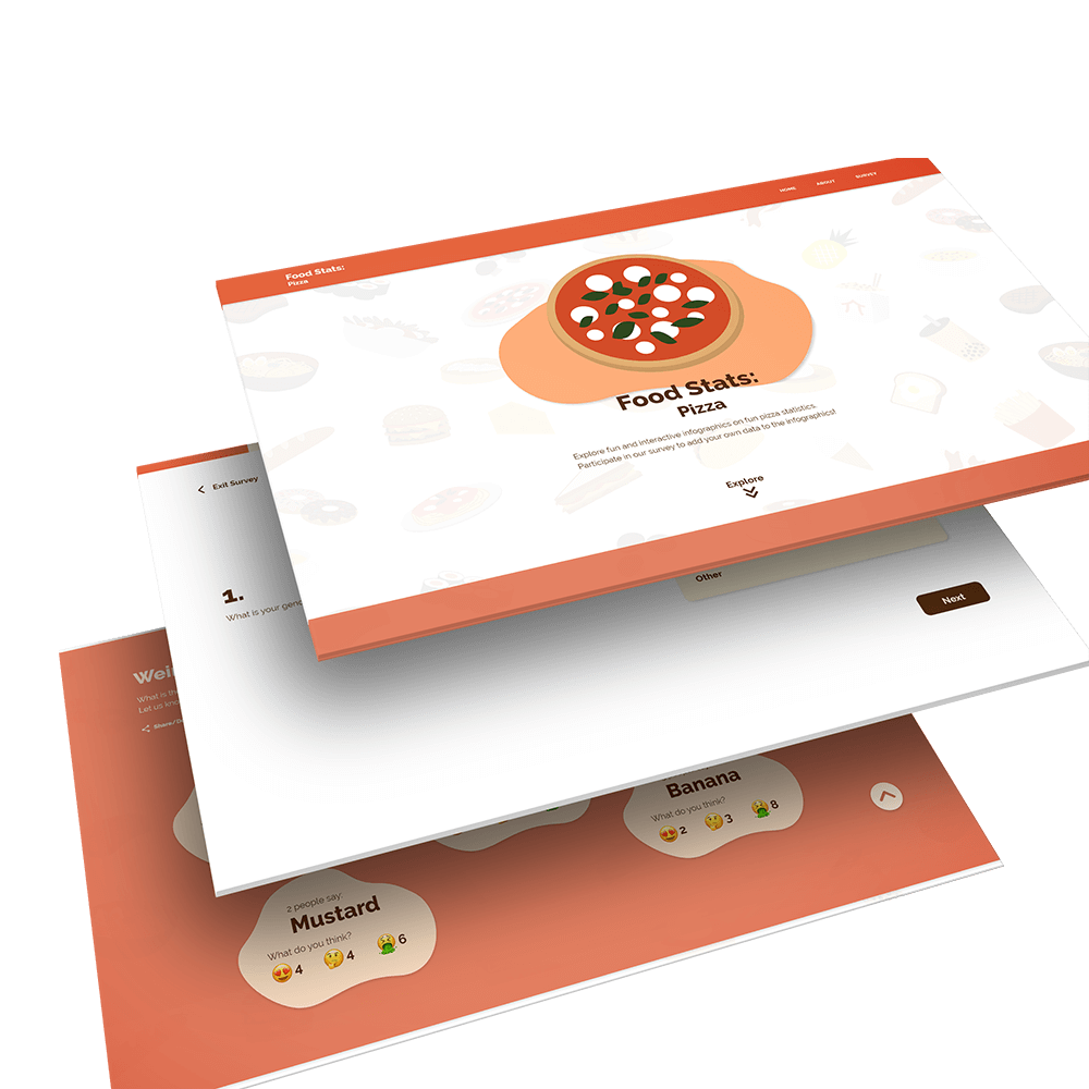
For pizza lovers, “Food Stats: Pizza” displays eye-catching infographics and explore the weird toppings that people have seen on a pizza. It is different from many others food infographics websites, “Food Stats: Pizza” is more interactive and solely focuses on pizza. It also has the option for audience to participate in the survey and add their own data to the infographics.
What I want to achieve in this project:
Unlike the ordinary data chart reports, “Food Stats” presents food statistics in a fun and interactive way. Users can interact with the infographics to see interesting food facts.
Doing a survey can be painful and tedious. In this project, I want to explore ways to make the survey filling experience more enjoyable and fun.
I have conducted three interviews with potential users. I asked them questions regarding what they wish to see in pizza infographics and their pizza eating habits. Here are the quotes that I got from them.

“I would like to see the most ordered pizza combination per country.”

“In Korea, we have kimchi and pork belly pizza, and they are very popular toppings in Korea.”

“I want pizza whenever I saw pizza ads or friends' posting pictures of pizza.”
After in-depth research, I've found out the target audience for my project:
Millennials
Most pizza lovers are millennials who care about their health and food consumption. They also tend to exercise regularly.
Gen Z Designers
Gen Z designers that enjoy looking at eye-catching and aesthetic designs. They like to explore fun and interesting things.

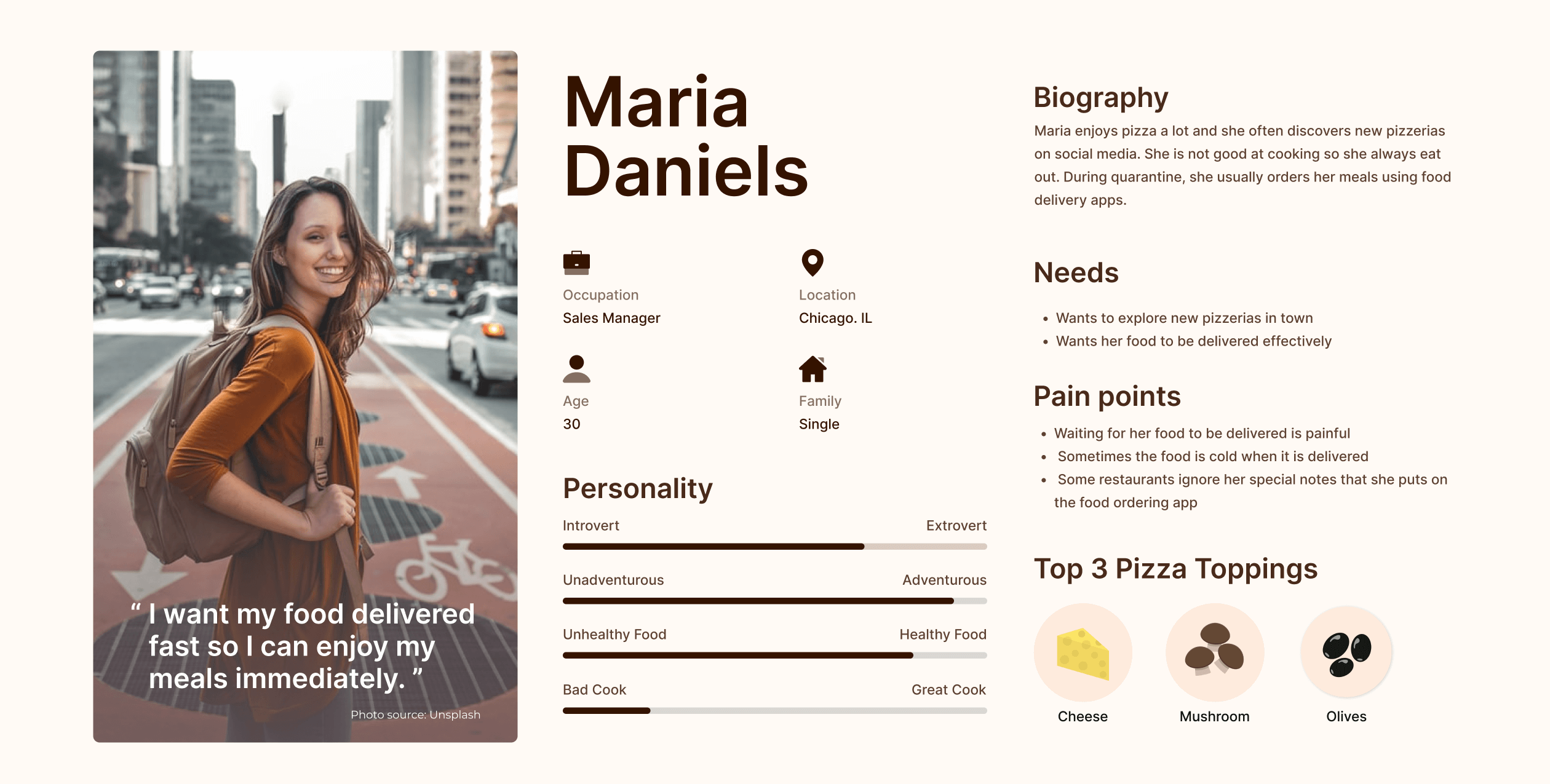
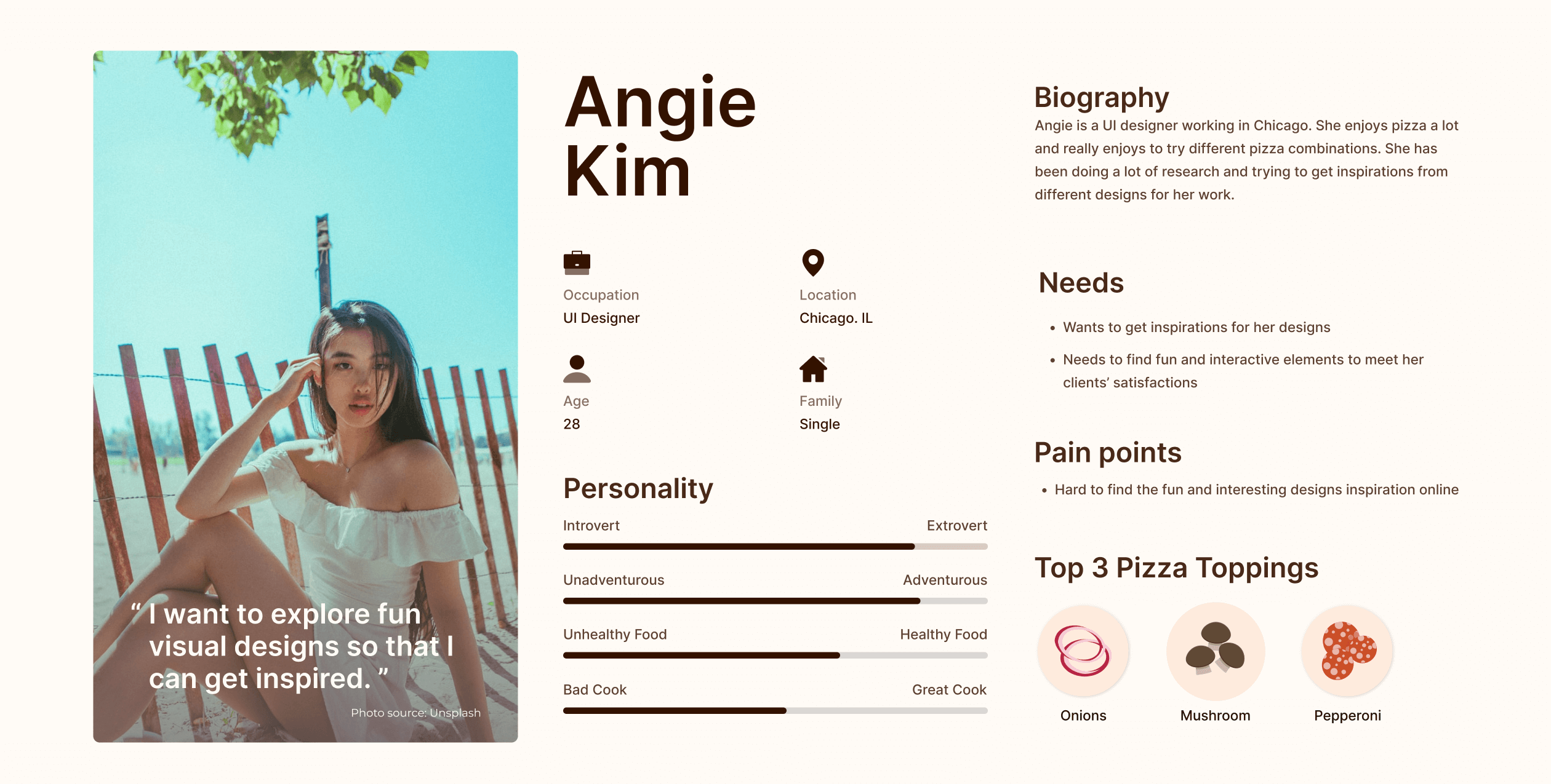
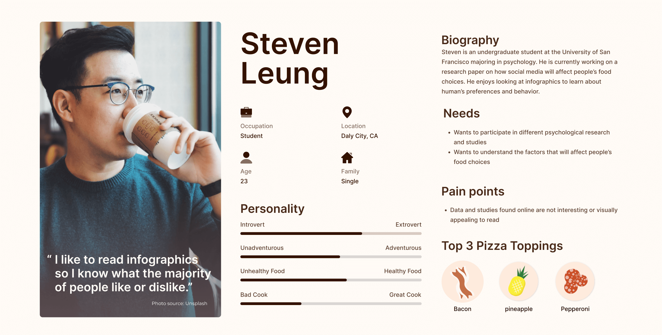
After combining all my research findings, I have developed three personas (Maria, Angie, and Steven) to define users' challenges and goals. They are essential for me to identify the user needs and make design decisions.
After defining the key features of my app, I have created three user flows to examine the purchasing process, dessert making process and the photo sharing process.
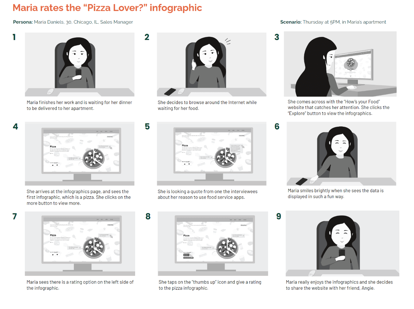
I then created a user story for Maria to further assist me with the design process.
Ideally, my project would…
Realistically, my project can…
I then began to sketch out the wireframes for my project and began my user testings with fellow classmates. I did a total of eight user testings on Zoom.
Here are some key takeaways that I got from my user testings on my low-fi wireframes:
01The user experience is not great when users have to click on the "next" button to view each infographic one at a time.
02Feels odd for users to not seeing the infographics instantly when they are on the page. Don't like the idea of clicking to reveal the data.
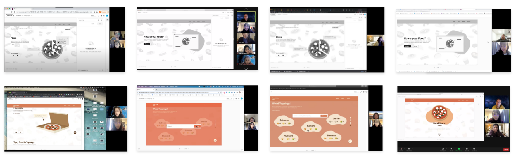
Based on the feedback I received, I then came up with a med-fi wireframes. I knew that the user browsing experience was not great, so I decided to change my layout of the website so that it is easier for users to interact with the infographics. I did a few more user testing on the new wireframes. Here are some key takeaways:
Based on the feedback I received from my user testing, I made new adjustments on my design. This time I focused more on the minor elements, such as the copy and the infographics, on the webpage in order optimize the experience further more.
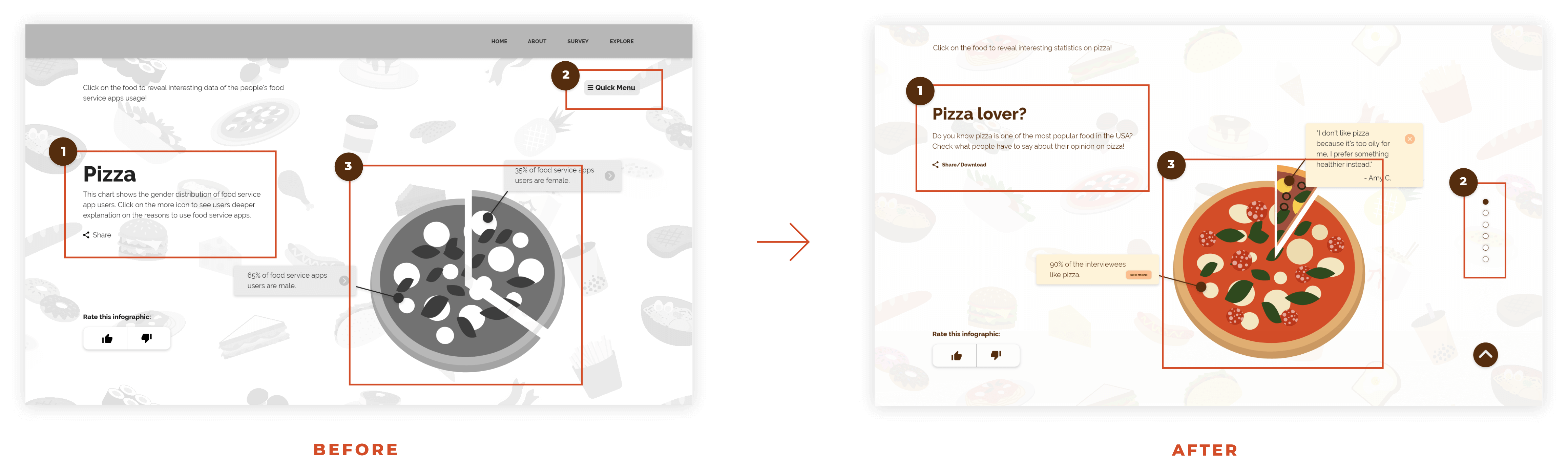
1 Edited the section title and micro-copy of the section to make the language more friendly
2 Removed the “Quick Menu” on top and replaced it with the row indicator on the right
3 Use a different type of pizza to represent different data set
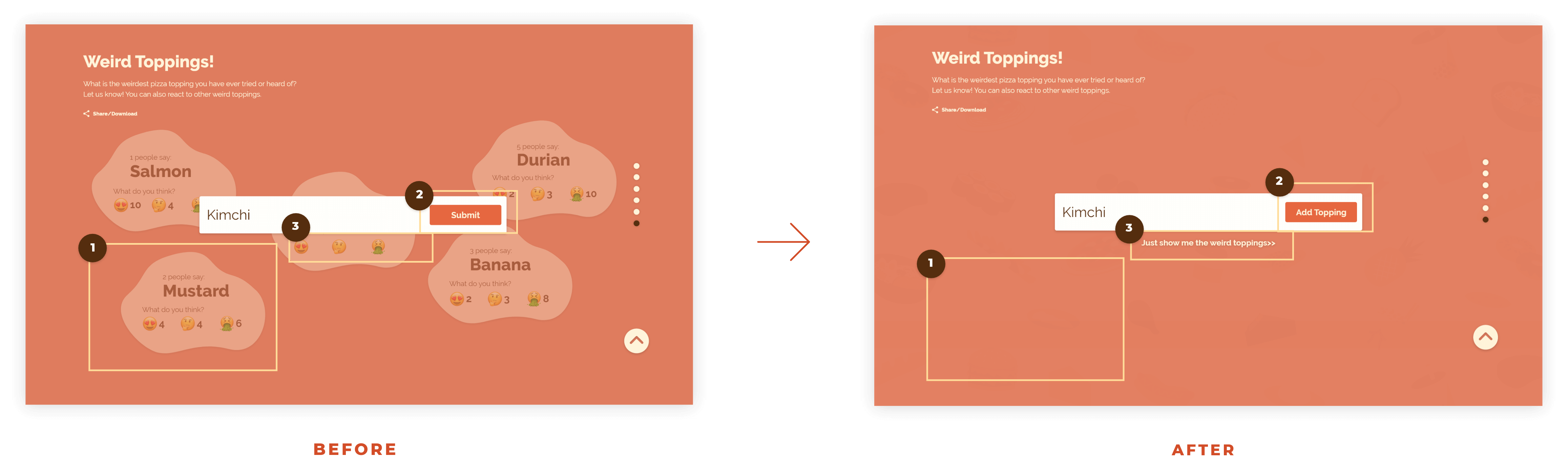
1 Drop the opacity of the text bubbles to 0 to avoid distractions
2 Changed “Submit” to “Add Topping” so it has a more friendly feeling
3 Added a option for users to view the weird toppings without adding any new toppings to the section
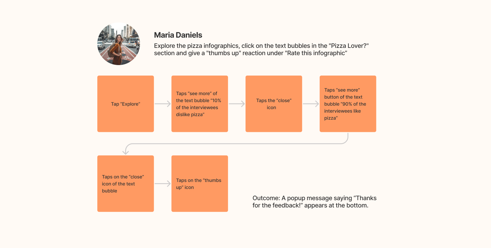
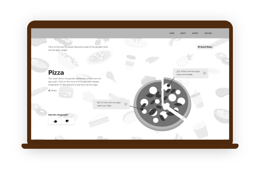
Infographic Section
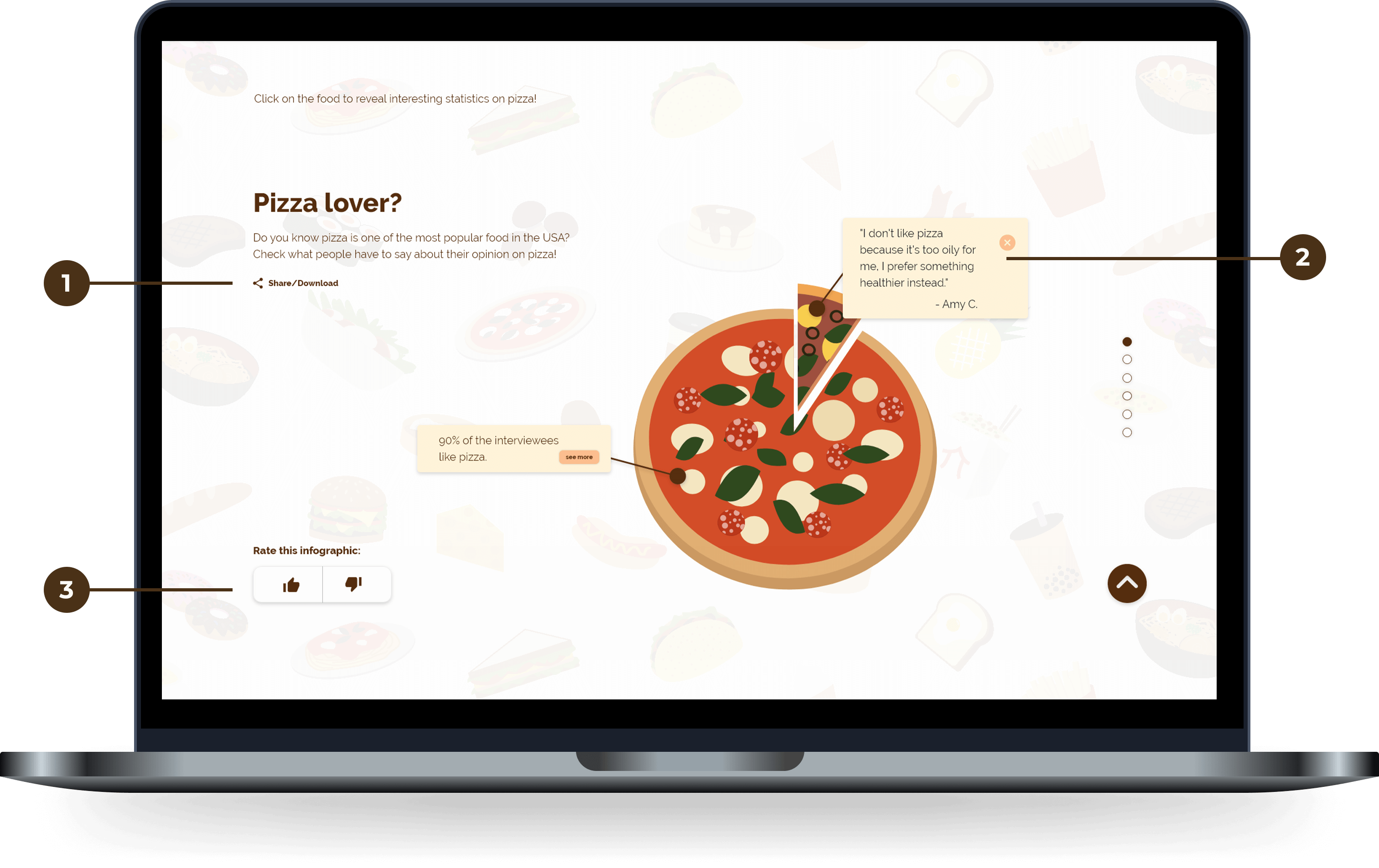
Users are able to share the infographics with their friends by sharing it to social media and downloading to their devices.
Users can interactive with the infographics and check out more in-depth content.
Users can rate each of the infographics here, and they can see the like/dislike ratio instantly after they submit a vote.
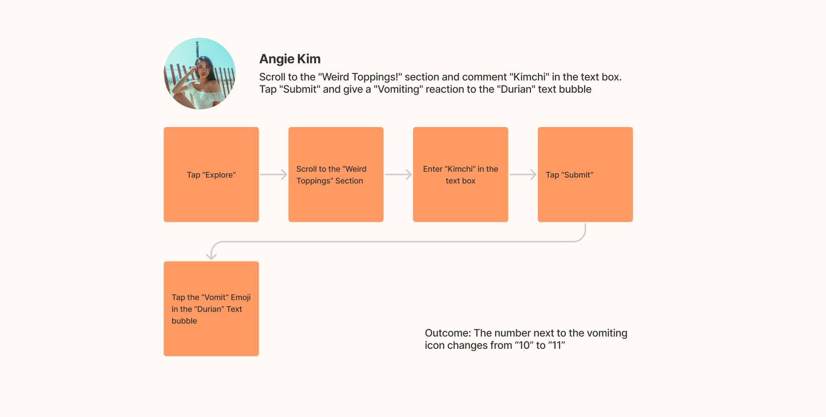
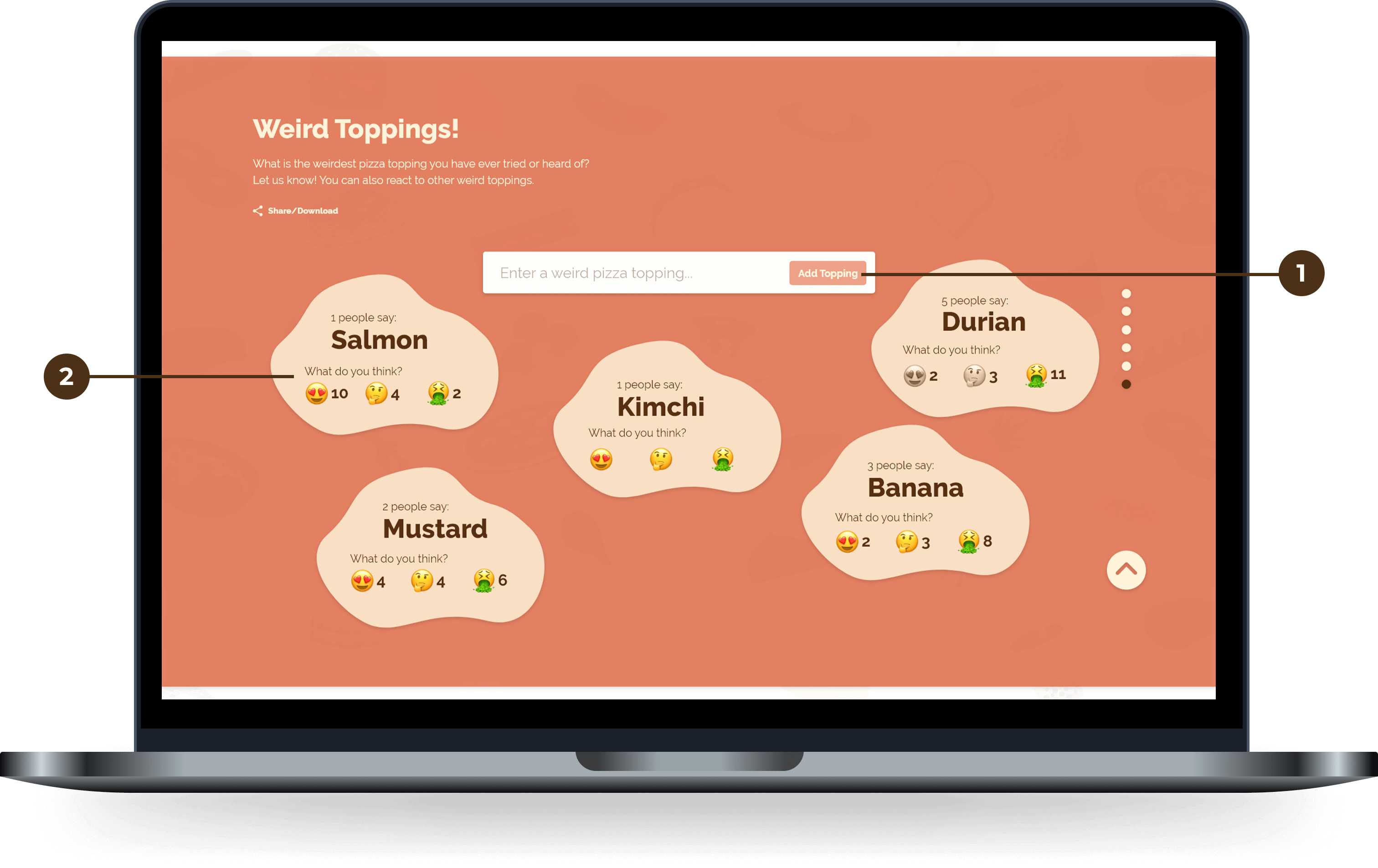
Users can share any weird pizza toppings that they have seen before. Their comments will be added to the section as well.
Users are able to see others' comments and give reactions to each of them.
Weird Toppings Section
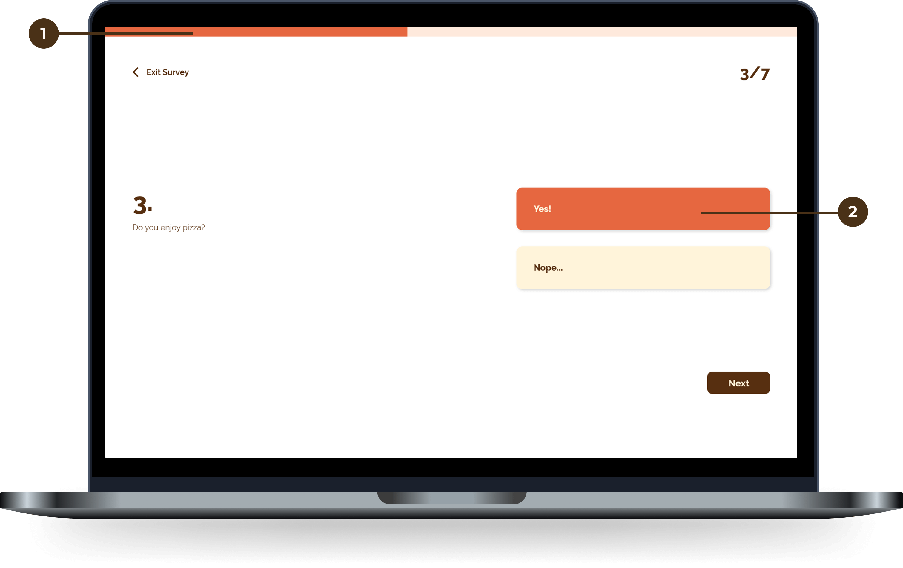
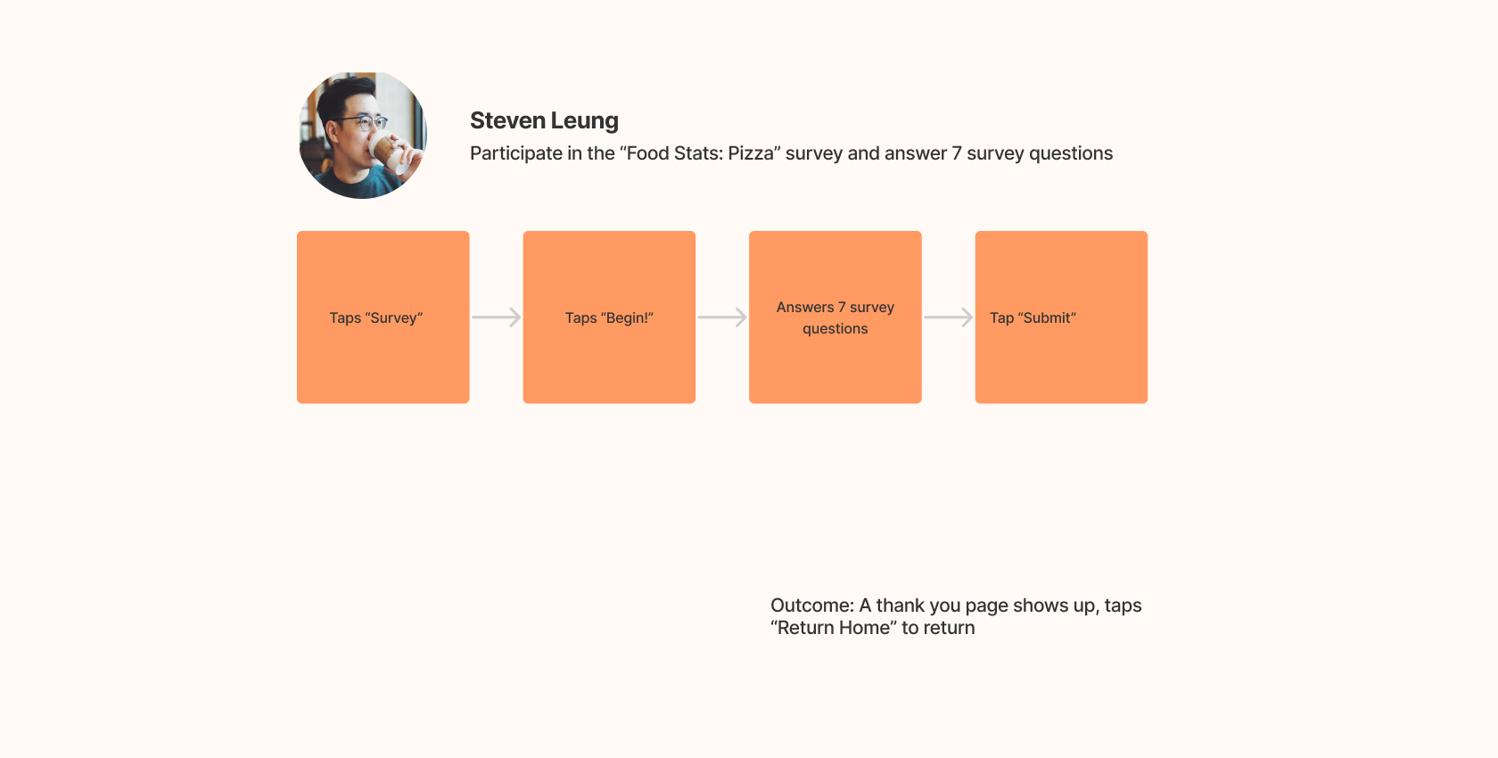
Survey Section
Survey progress bar displays on top to indicate how many questions left.
A friendly and causal tone is used in the survey question to optimize the overall survey experience.
Here is the interactive prototype that I created using Adobe XD.
Making Food Stats allows me to explore new ways to create infographics and learn how to manipulate data in a more casual and visually appealing way. Even though I only have a limited amount of time to finish the project, I still think it is an enjoyable experience. As a food lover, I always love to know how others think about the food I like, and it is really interesting to learn more about people's food preferences. In the future, I would totally love to do a new project on other food, such as tacos, or dim sum!
Somthin' Sweet
Purry