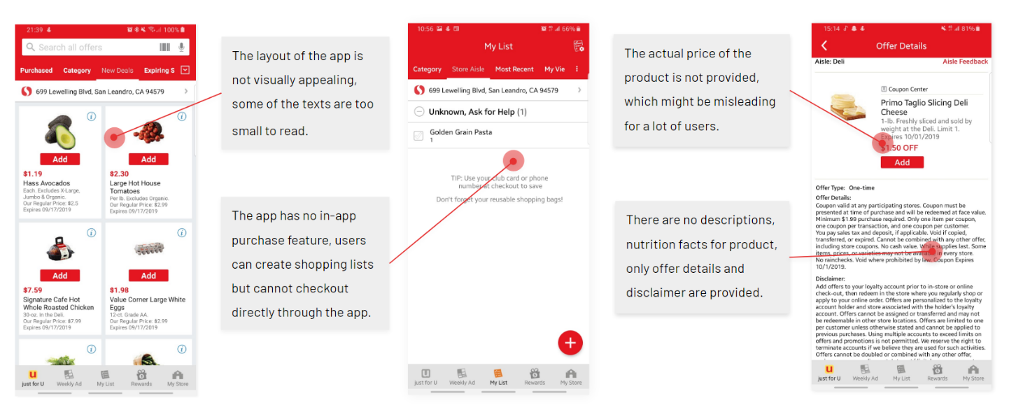
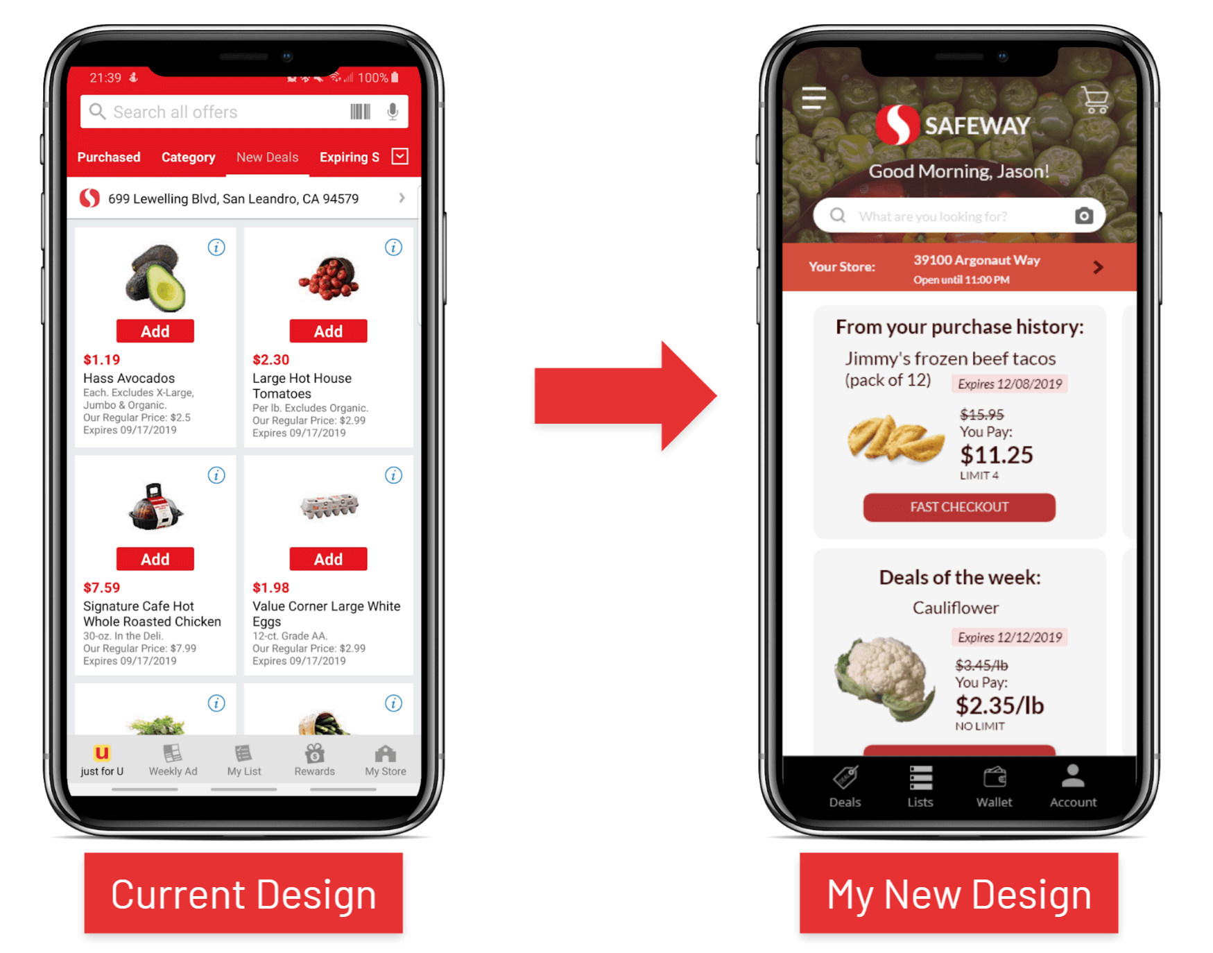
On the current Safeway app, users are able to find in-app-only discounts and access weekly ads from anywhere. Users can manage their Safeway membership account on their phones as well as view their reward points. They can also build shopping lists from the app and find offers by aisle, category, and purchase history.
UX/UI Designer
Fall 2019
On the current Safeway app, users are able to find in-app only discounts and access to weekly ads from anywhere. Users can manage their Safeway membership account on their phone as well as view their reward points. They can also build shopping lists from the app and find offers by aisle, category and purchase history.
01 Make the app more consumer-friendly by showing the actual pricing and nutrition facts of each product.
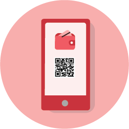
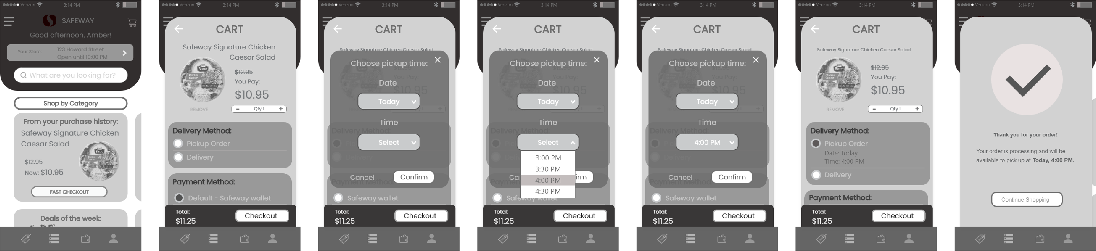
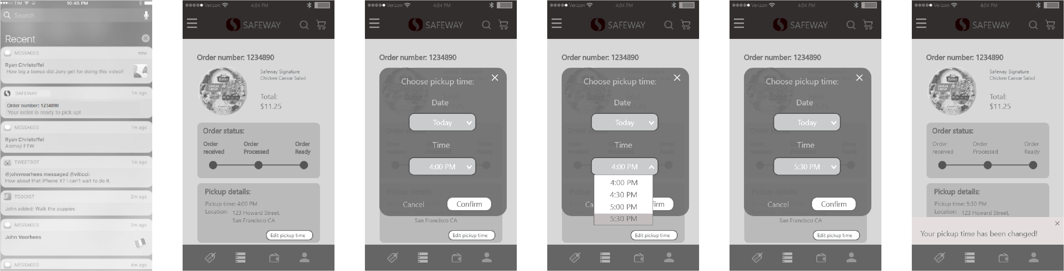
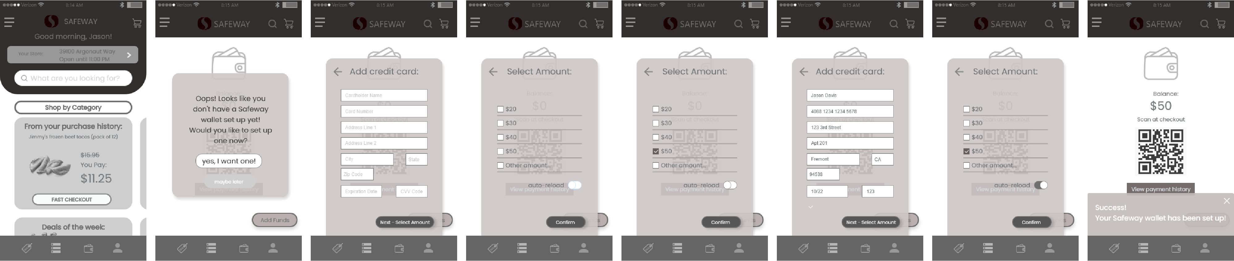
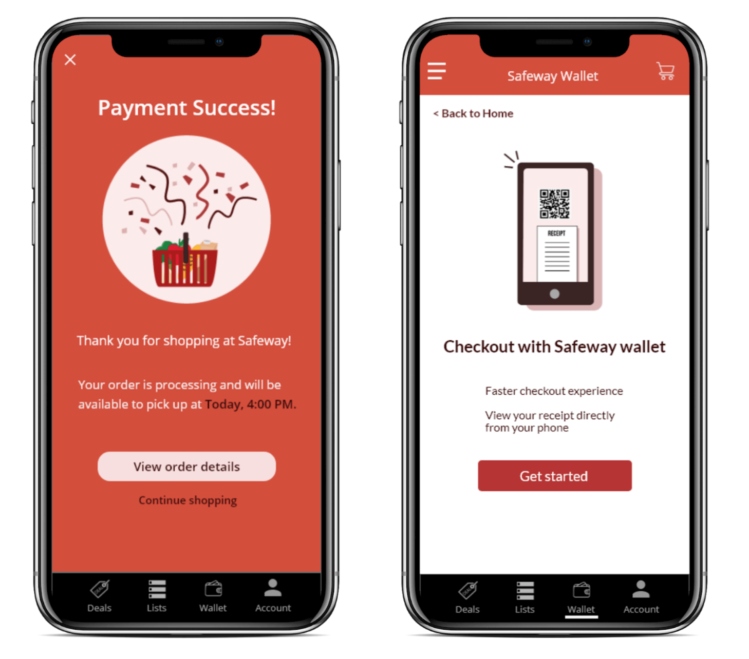
02 Enhance users’ shopping experience by adding the in-app wallet and delivery features.
03 Utilize user experience by removing unnecessary sub-sections and overwhelming details.
I first analyzed the current Safeway app and listed some of the features that might need to be redesigned.
I identified three Safeway competitors and conducted a competitor analysis to understand what are the existing market is offering to their customers and what might be missing from them.

I have conducted three user interviews and asked them their grocery shopping experience as well as their opinions on the Safeway app.

“I don’t have a car… would be great if the grocery can just deliver to my door.”

“Very confusing… I don’t know where to look for the stuff that I want. I wish it can be simpler.”

“They don’t think as a designer, they are not using full advantage of the layout.”
I then conducted a Google survey and received 42 responses. Here are some of the data that I got:
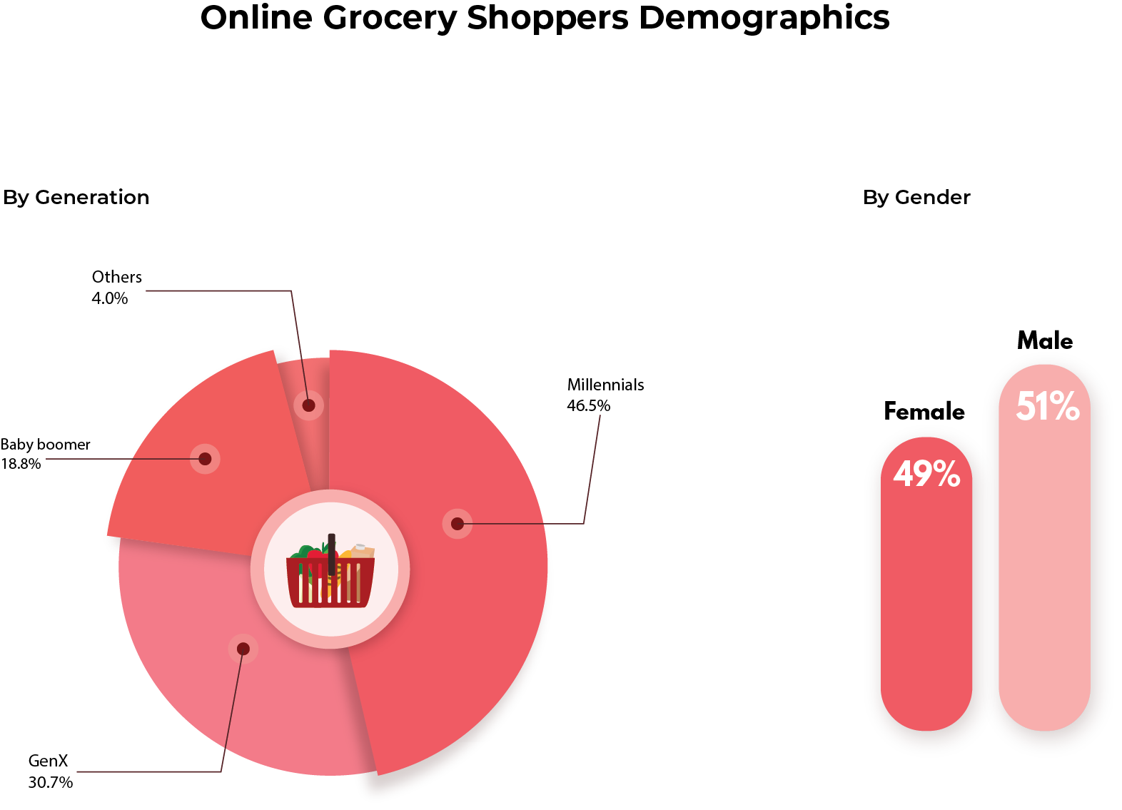
After in-depth user research, Here are the key points that I concluded:

01Price is the first priority for grocery shoppers.
02Most shoppers prefer to pick their own product in store.

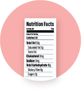
03The majority of the shoppers care about nutrition facts.
04Most shoppers want to have a faster checkout service.
Our target audience are both male and female, aged from 22-55, who live in urban area in Northern California, and enjoy a fast-paced and high quality grocery shopping experience at an affordable price.
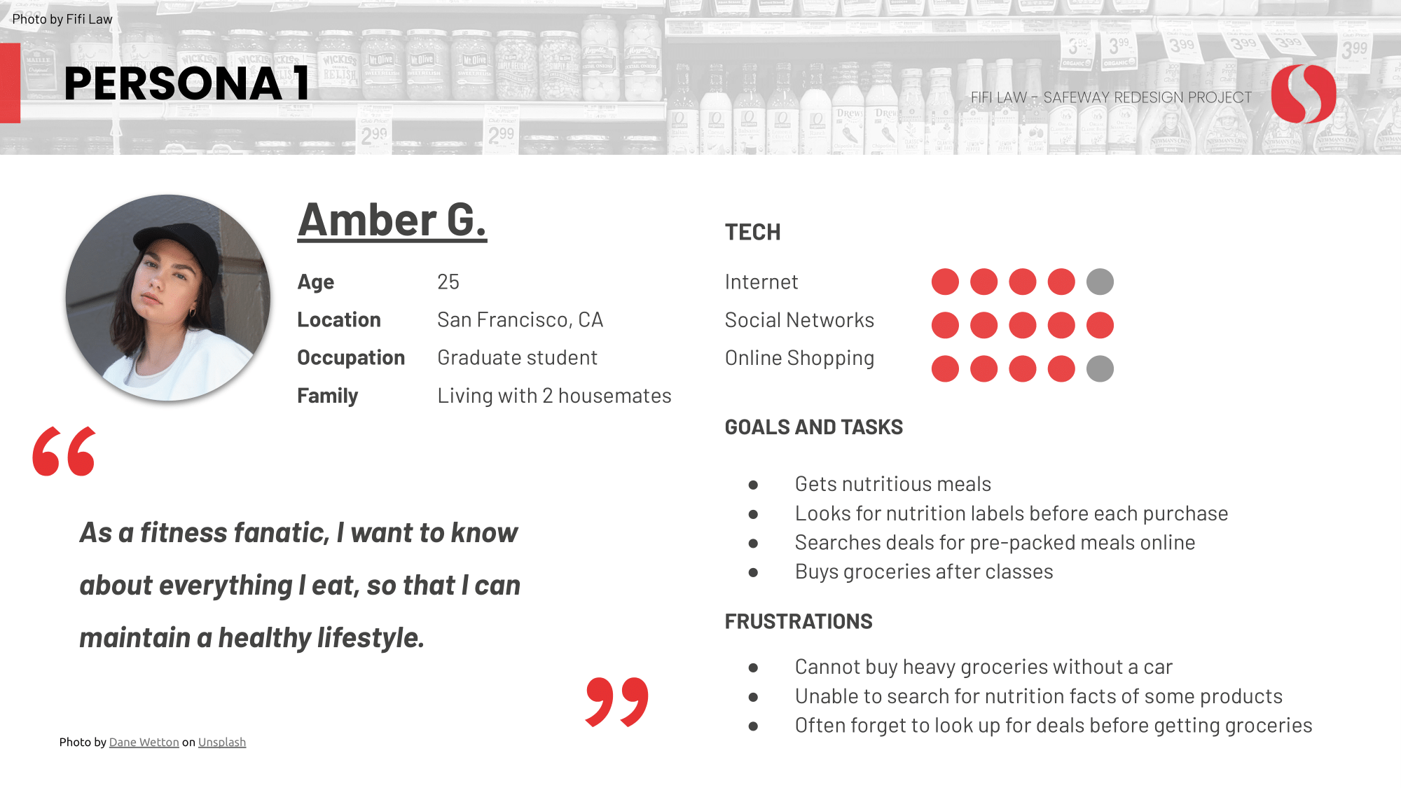
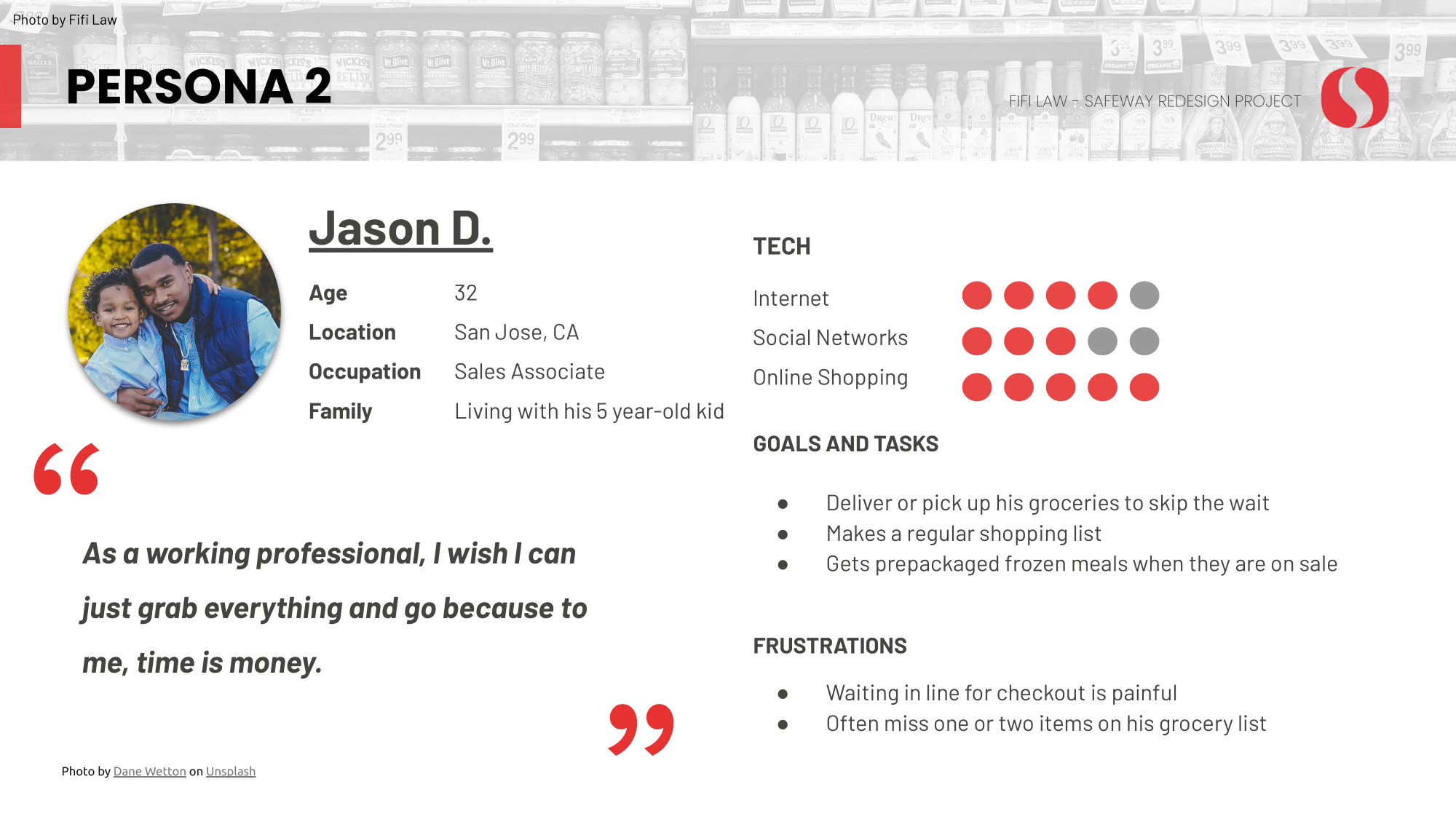
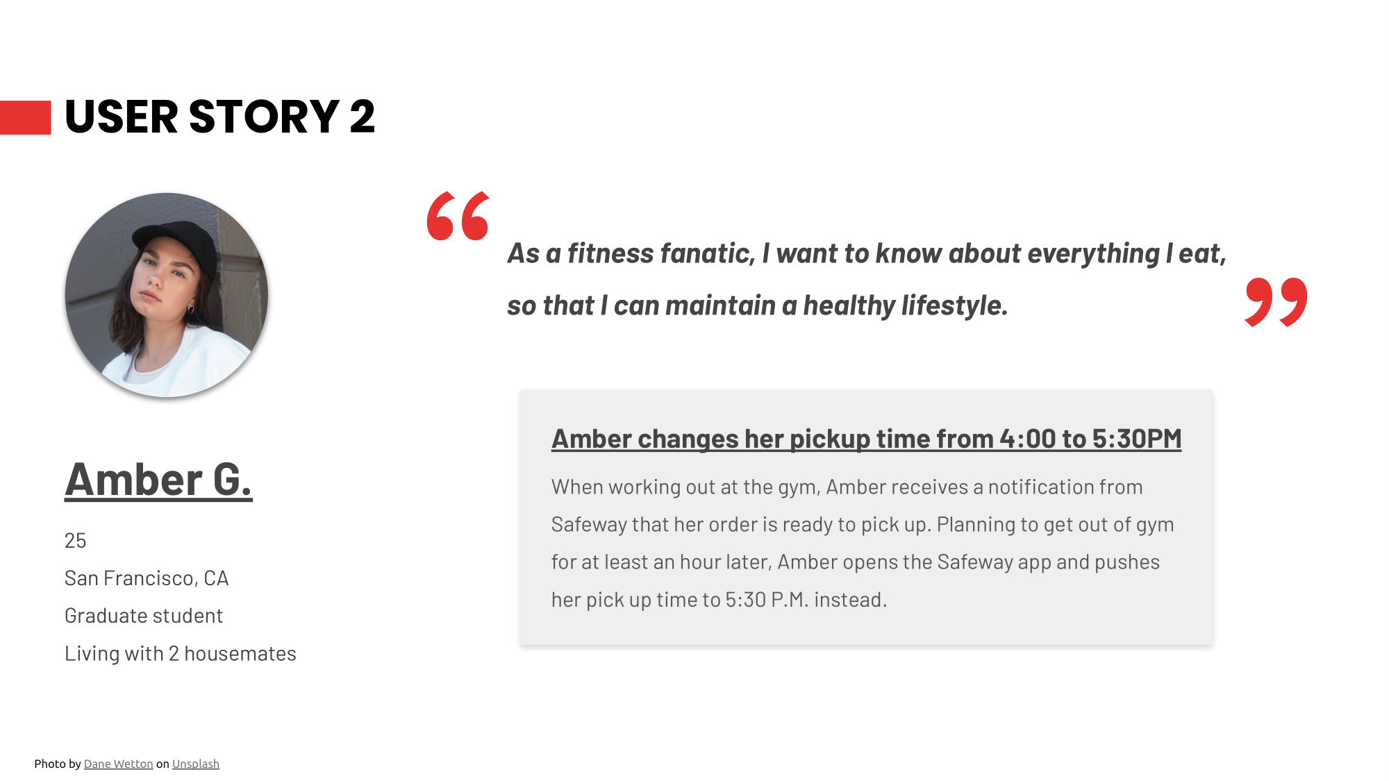
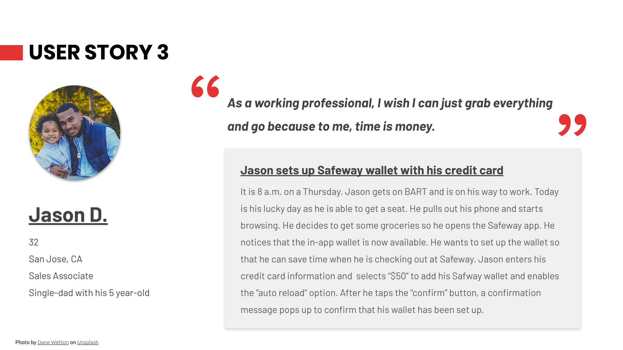
After combining all my research findings, I have developed 2 personas (Amber and Jason) to define users challenges and goals. They are essential for me to identify the user needs and make design decisions.
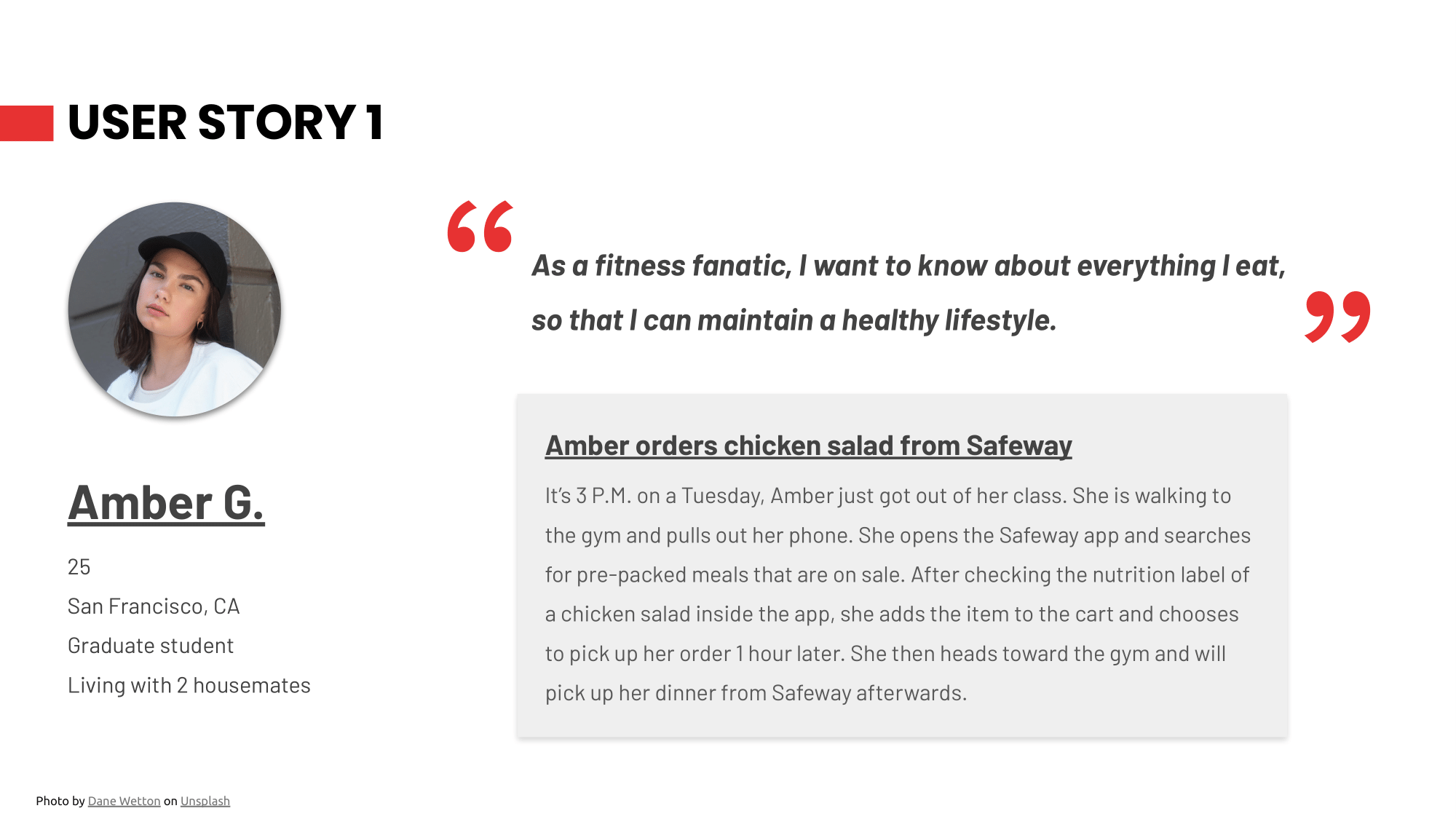
I then created three user stories to further assist me with the design process.
Based on the three user stories, I then created three user flows for the redesign project. This helps me easier to understand the app features and guides me in later design stage.
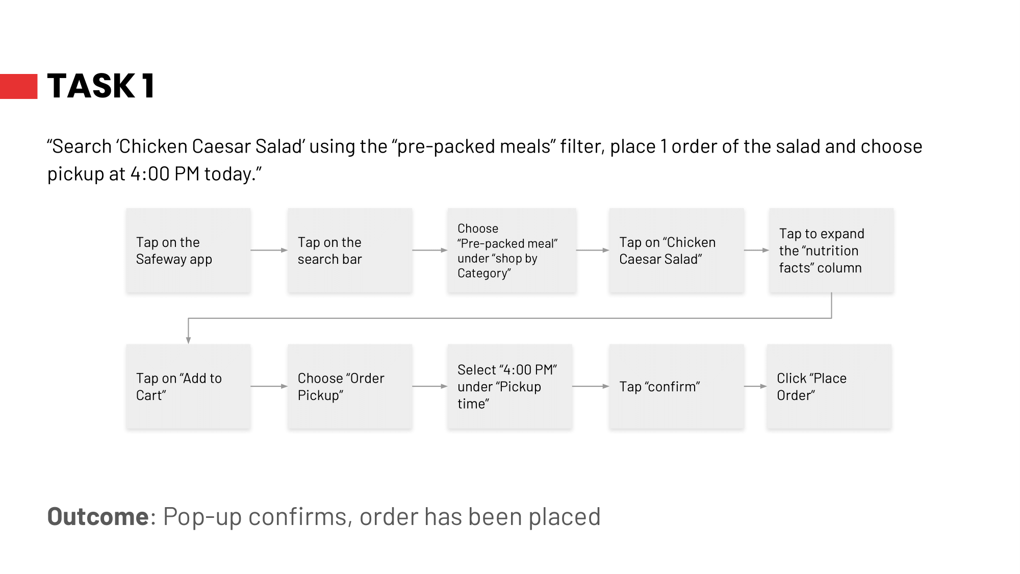
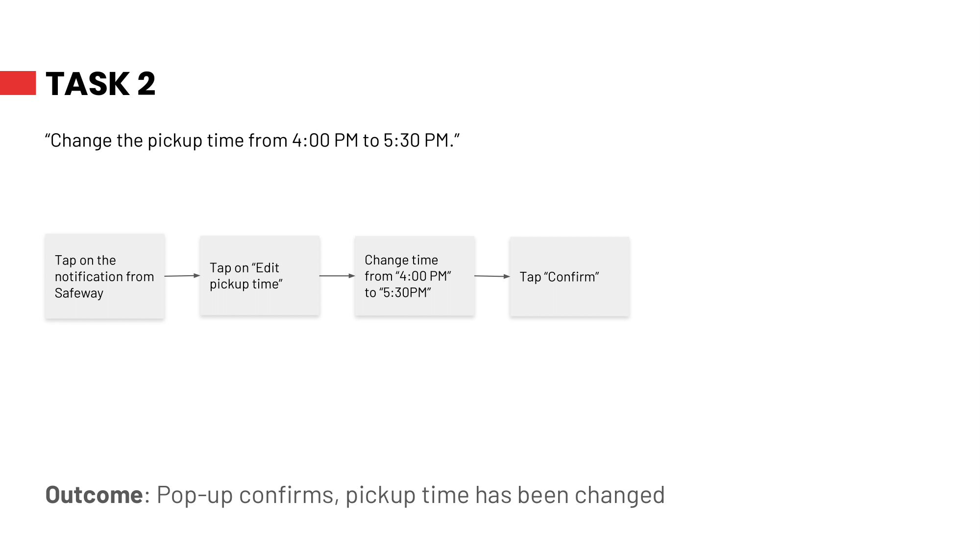
I began to sketch out some wireframes and worked on user testings.
Task 1
Task 2
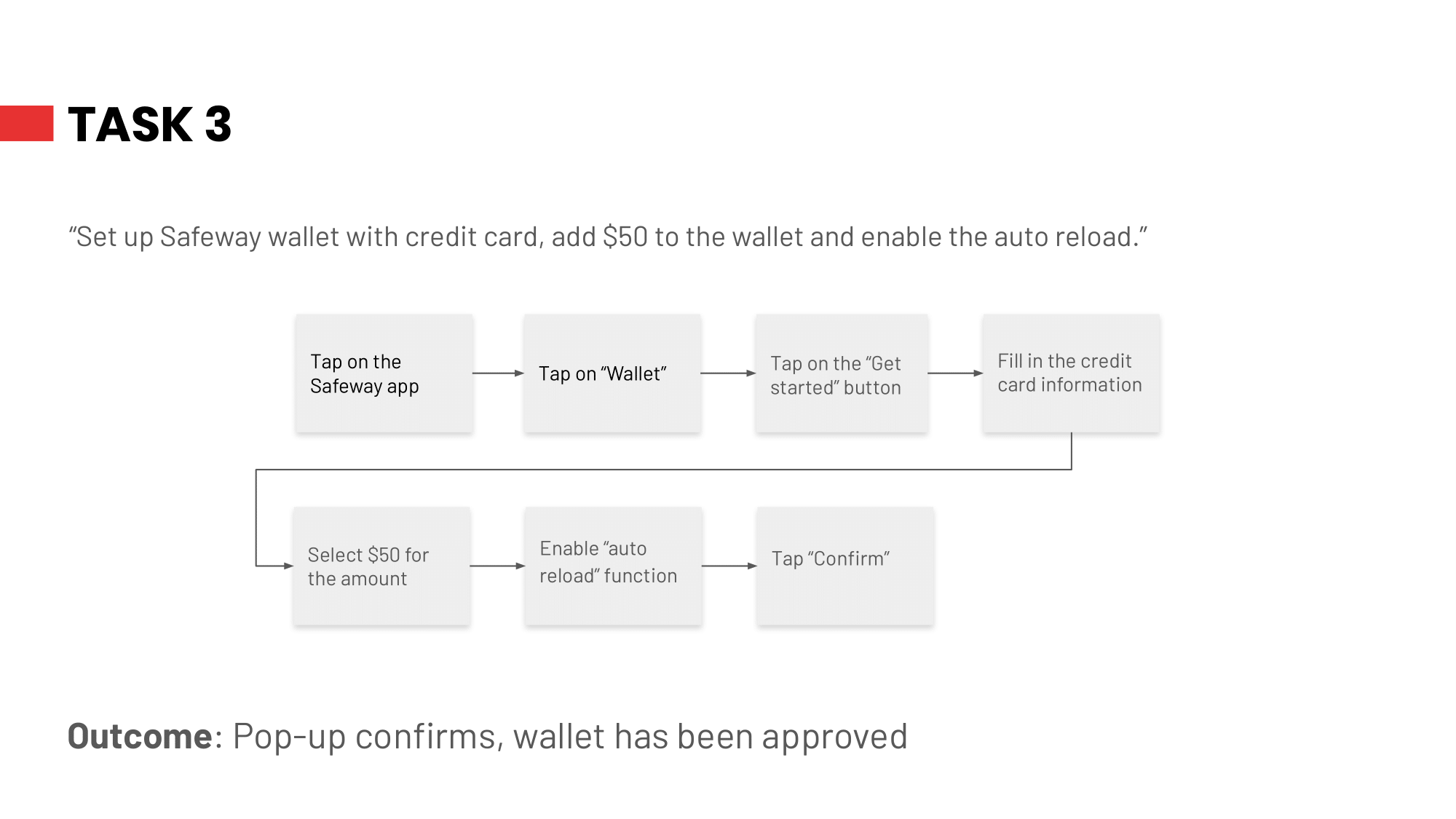
Task 3

Test Date: 11/18/2019
Moderator: Ji Won Yeom
Tester: Dan Li
Feedback:
Test Date: 11/19/2019
Tester: Wallace Lau
Feedback:

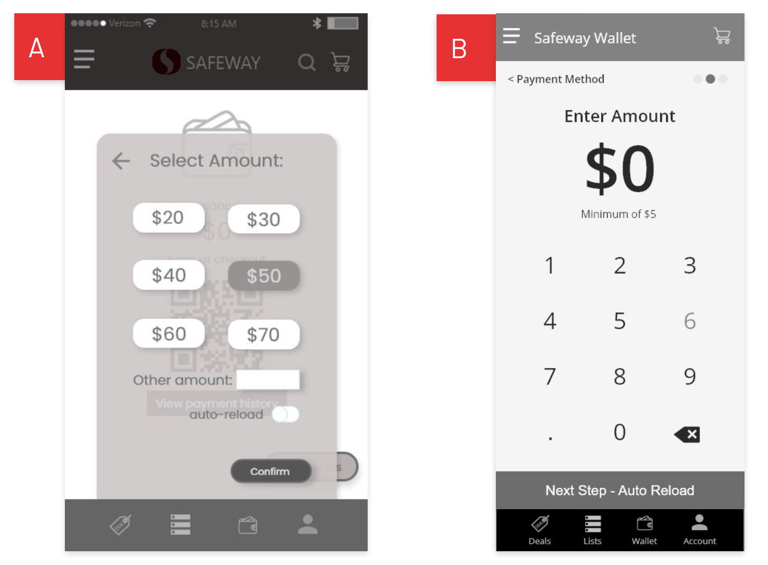
Which design do you prefer for entering amount? With
presets or keypad?
A: 2 votes
B: 3 votes
Feedback:
Version B has a cleaner and simple design, entering the
amount would be easy for the users. However, it might be
better to have presets for some users.
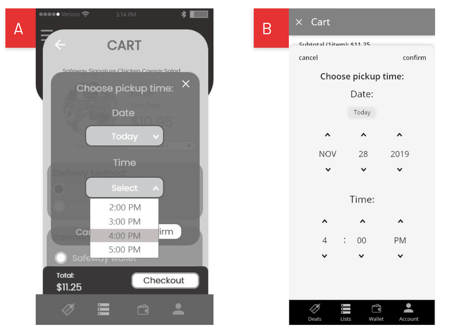
Which design do you prefer for
a time selection page?
A: 1 vote
B: 6 votes
Feedback:
Version B allows user to choose a more accurate
time for themselves, and the design is simple
and clean. Version A hastoo limited time to choose from.
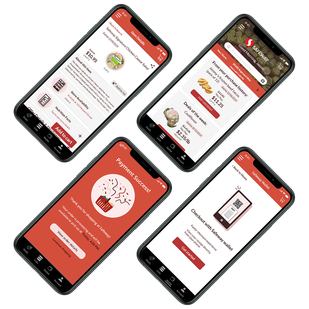
Homescreen
1 Add greetings message at the top of the homepage
2 Remove unnecessary sub-sections and allow users to browse through deals by scrolpng and swiping
3 Add “fast checkout” function
4 Rearrange the layout and make the texts bigger in size
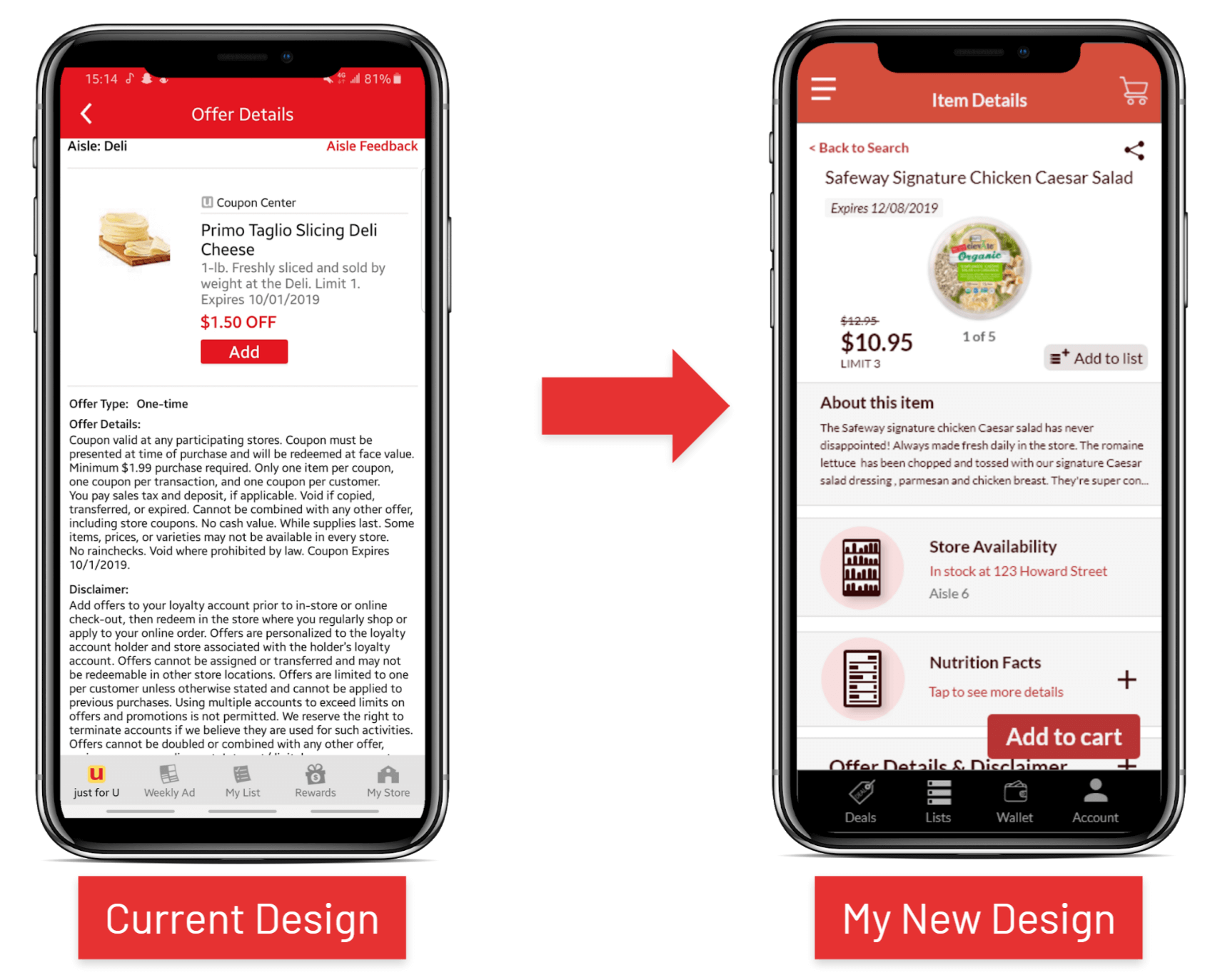
Product Detail Page
1Show actual price of the product
2Include detailed descriptions and nutrition facts of the product
3Add “Store Availability” section under product description
4Put offer details and disclaimer in an expandable section
5Include additional images of the product in the page
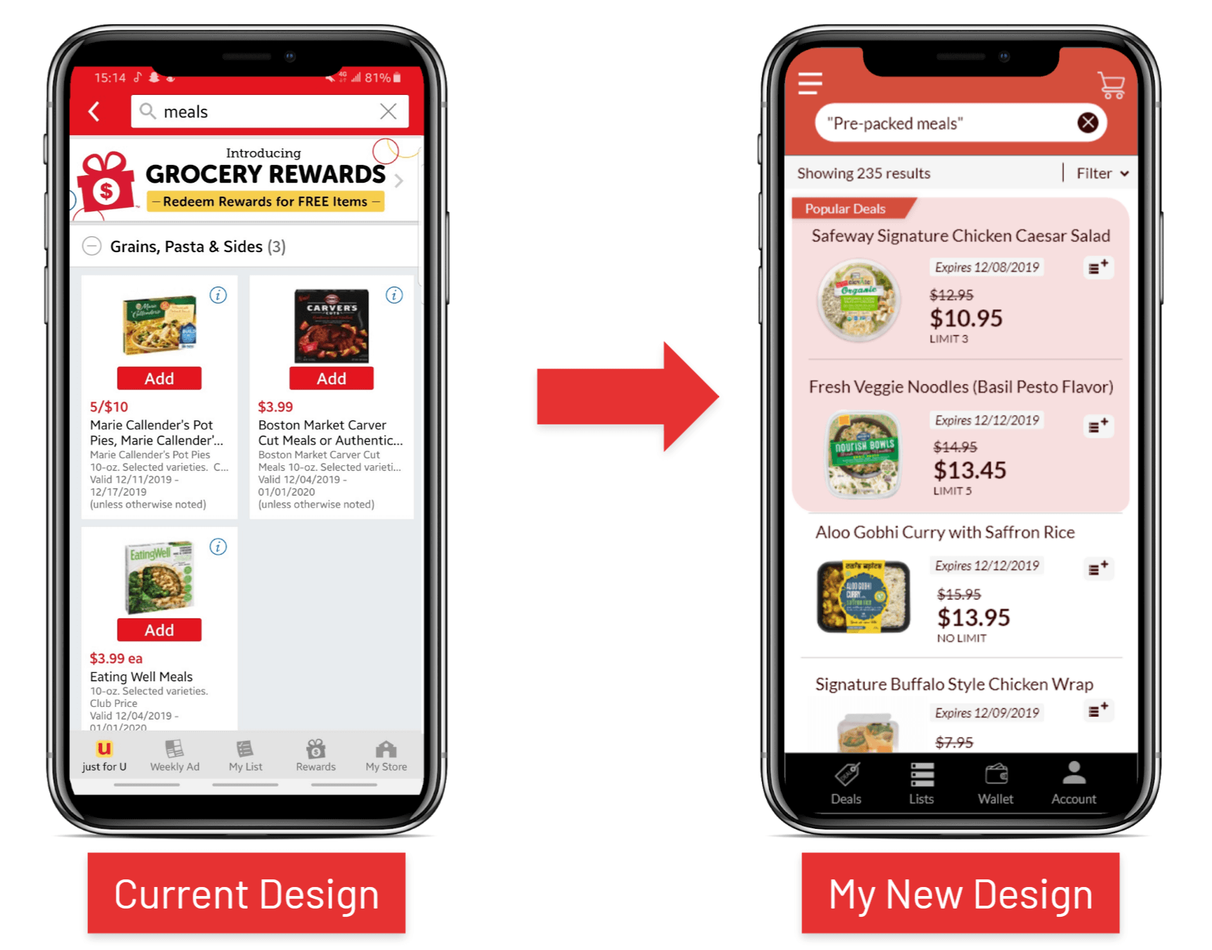
Search Results Page
1Add filter functions to allow user to search for more specific items
2Highlight popular deals to attract more users to buy them
3Rearrange the layout of the page to make the details of each item larger and more readable
4Minimize the “add to list” button to utilize the layout of the page
In-App Purchase is now available:
Meowie
Somethin' Sweet